
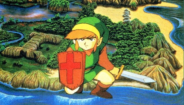
The The Legend of Zelda franchise is one of Nintendo’s most celebrated jewels, consistently reinventing itself through memorable characters and ingenious gameplay. If there is one thing we can never complain about in a Zelda title, it is the art direction. With the recent announcement of the Ocarina of Time remake sparking heated debate over its modern aesthetic, it is the perfect time to look back at the visual styles that have truly aged like fine wine.
The Best Zelda Visuals Ranked
While some fans feel recent projects lean too heavily into generic engine aesthetics, Nintendo’s history is filled with bold creative choices. Here are the standouts that define the series' visual evolution:
- 10. Link’s Awakening (2019): Developed by Grezzo for the Switch, this remake uses a 3D diorama style that makes the world look like a collection of shiny plastic toys. It perfectly matches the surreal, dream-like tone of the original adventure.
- 9. A Link to the Past: This SNES gem set the golden standard for 2D design. Its distinct visual layouts for the Light and Dark worlds remain a masterclass in readable, engaging pixel art.
- 8. The Minish Cap: Arguably the best-looking pixelated Zelda game, this GBA title features a vibrant, cartoon-like palette that brings its whimsical premise of shrinking Link to life.
- 7. A Link Between Worlds: This 3DS title successfully blended 16-bit top-down nostalgia with crisp 3D models and a diorama-like camera, creating a perfect bridge between classic and modern aesthetics.
- 6. Twilight Princess: Known for its dark fantasy atmosphere, this title pushed for a more grounded, realistic look. While the moody lighting remains top-tier, its textures show more age than the series’ more stylized entries.
- 5. Breath of the Wild: By combining anime-inspired, cel-shaded characters with watercolor environments reminiscent of Studio Ghibli, this title created an impressionistic style that feels like an interactive painting.
- 4. Ocarina of Time: As the franchise's first foray into full 3D, this game defined the "cinematic scale" for the N64 era. While blocky by modern standards, its polygonal charm remains a touchstone for the series.
- 3. Majora’s Mask: By reusing assets from Ocarina of Time but injecting a surreal, somber identity, the developers created an unsettling, unique vibe that stands distinct from its predecessor.
- 2. Skyward Sword HD: The Switch update finally removed the muddy textures and jagged edges of the original Wii release, allowing its impressionist, watercolor-inspired world to shine with dynamic, shifting color palettes.
- 1. The Wind Waker: Despite initial fan backlash to its cartoonish look, The Wind Waker is the ultimate example of ageless design. Its fluid, expressive animation and distinct cel-shading have allowed it to remain visually stunning years after its release.
Whether you prefer the grit of Twilight Princess or the whimsical charm of The Wind Waker the franchise has consistently proven that stylized art direction often outlasts the pursuit of photorealism. As we look toward the future of the series, these titles remain the gold standard for how to build a world that feels as vibrant today as the day it launched.